Editorial design: Himba
Brief summary
The ISTD Student Assessment scheme is reviewed annually to ensure that it reflects current best practices in both design education and industry. Strategy, research, target audience, concept development, typography skills, specifications, presentation and credibility are considered for this project. One of the following briefs had to be completed for this project: Lighthouses of the World, Agenda for Sustainability, Shaping the World, A Colourful Story or Typography Research Unit.
Project deliverables
01. Strategy
02. Research
03. Design development
04. Specifications and grids
05. Final outcomes
View final outcomes in full detail here.
Design strategy
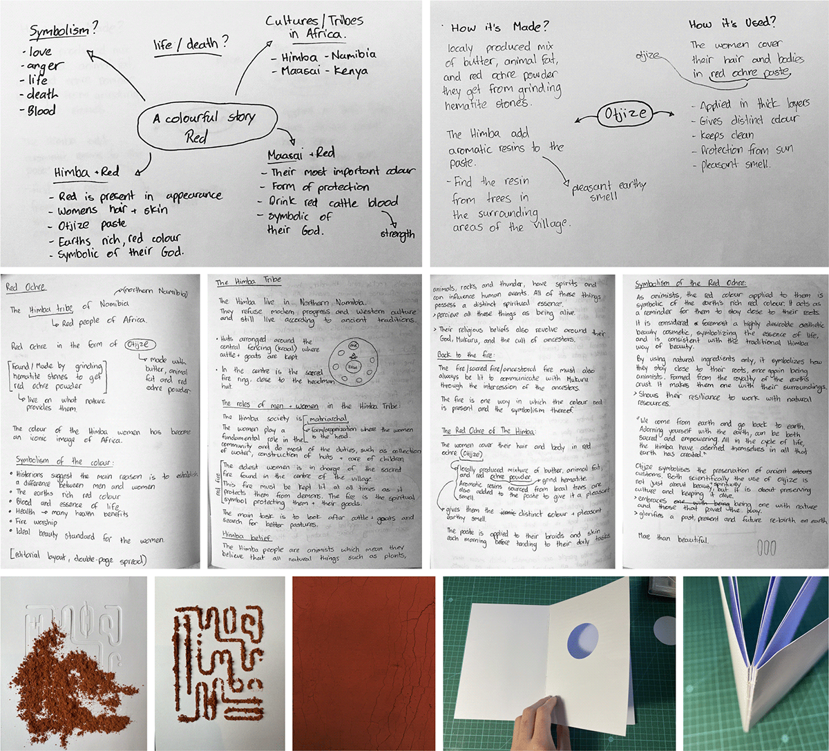
Himba is a response to brief 4 of the 2022 edition of the ISTD’s annual brief. This editorial project explores the colour red and how it is specifically symbolic in the Himba tribe. The Himba tribe, based in Northern Namibia, are known as the Red Icons of Africa. This title came to be because the women of the tribe are physically red in colour. They achieve the red colour by applying a natural, hand-made, paste to their skin called otjize .They are popular amongst tourist photographers and have become known worldwide because of them and the images they capture.
The colour red has many different meanings in various cultures, it can be a symbol of life or death, love or anger, vigor, or war. I thought, surely there is more to the Himba tribe than what the world sees. This idea made me curious as to what the symbolic meaning of the colour red is within the Himba Tribe, to search for that deeper meaning behind the aesthetic, skin-deep beauty that photographers portray. After doing thorough research, i discovered that there is a much deeper symbolic meaning to the colour red within the tribe which makes them even more unique.
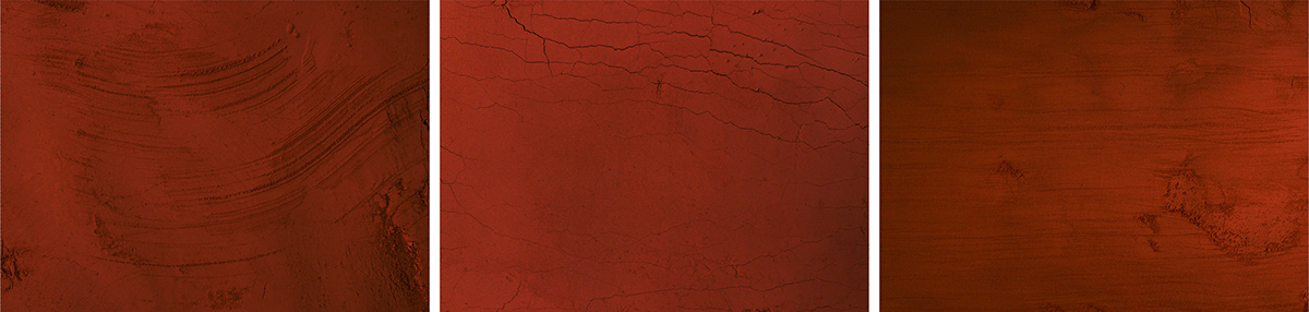
Taking this into consideration, I decided that doing an editorial book would be perfect to educate people on the symbolism of red in the tribe. Humans are curious beings so i thought a suitable way to show this would be to take readers on a journey of discovery, something they can interact with. People are generally drawn to thing that look appealing, so i decided to take the aesthetic beauty of the red icons and base the style of the book on it. Minimal layouts are designed to show the beauty of the tribe and colour ,but more importantly, to allow the written content of the book to stand out. The style is carried through with the typeface selection. The typefaces which i chose are minimalistic and have organic forms, similar to the Himba way of life. Textural elements and backgrounds are used as the main form of colour. By creating and photographing textures to mimic the natural earth, I was able to bring the book to life, to highlight the realness of the Himba tribe.
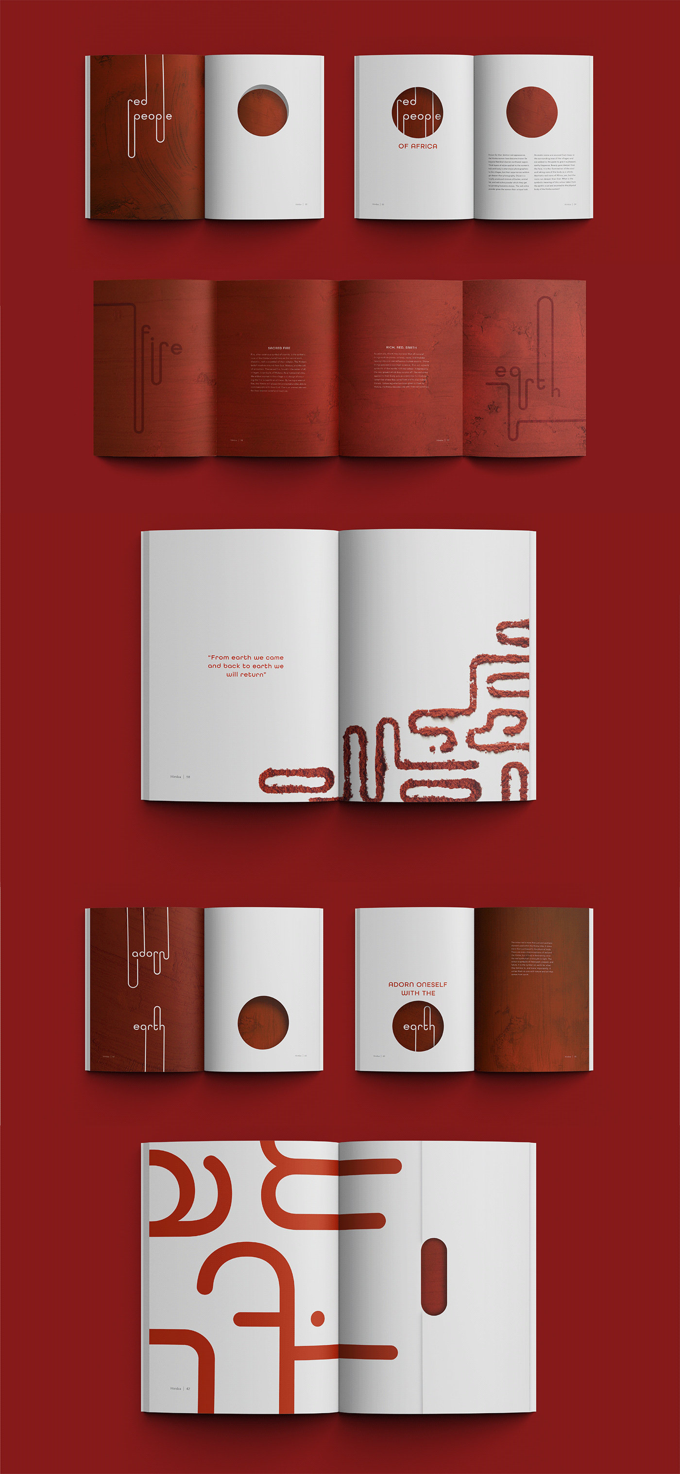
The book is designed with unfolding pages and cut-outs which reveal some of whats on the next page. At first, readers are met with a title page and cut-outs on the page which highlights a theme. The cut-outs reveal part of the next page which aims to spark an interest as to what comes next. When the page is turned or unfolded, the deeper symbolic meaning of the colour would be revealed.

Research and development
Typography
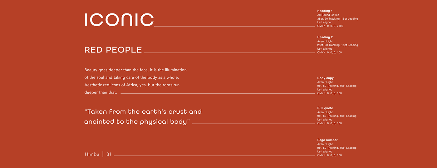
This typeface is inspired by classic sans serif fonts. It has a simple and structured form as all unnecessary stems are removed. The rounded shape of the characters also emphasize the organic theme of this project. Avenir is a structured sans serif typeface with clean letter forms. Rounded curves on letters bring in the organic element and create good contrast with the straight lines within the typeface.
Colour and expressive headings
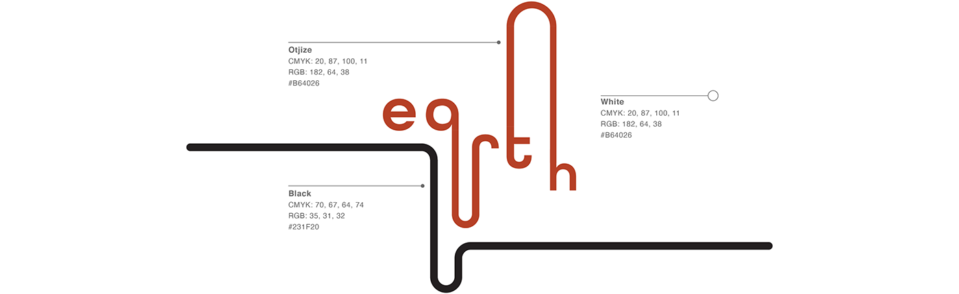
The colour palette i have chosen to use for this project is quite simple but effective in terms of the theme. The Himba tribe follow a simple lifestyle and use mainly natural resources from the ground they live off. The red I have chosen to use is symbolic of the red otjize of the Himba and the colour of the ground surrounding the location in which the Himba are found. Alongside red, white is used as the primary background colours to allow for sufficient breathing room.
The expressive headings are made by manipulating the All Round Gothic typeface. Ascenders and descenders are extended and connected to each other through rounded curves. The style of these expressive headings draw inspiration from the natural look of traditional Himba hairstyles. The headings also act as illustrative elements which can incorporate colour and texture.
To make this book unique and highlight the realness of it, expressive headings and symbols may be done in powder. The powder represents the sand and earth of northern Namibia. Expressive headings and symbols should cut out of paper and used as a stencil for the powder, this way and organic looking form is achieved.
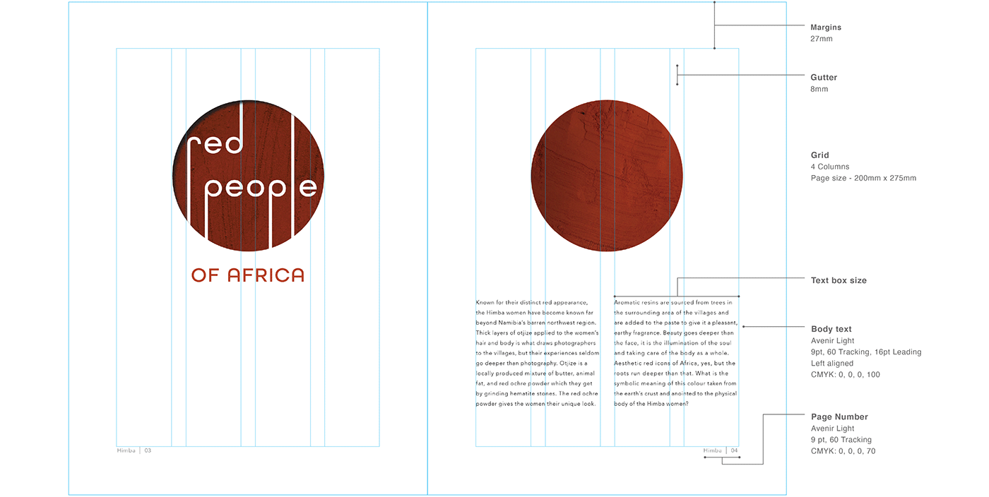
Grids
The grid selected for this editorial design plays an integral part in balancing out whitespace and text. It allows text to be the focal point of the design with no distractions. The grid consists of four equal columns with large margins. Text boxes should not be bigger than the width of two columns. This ensures shorter lines which will improve the reading experience.

Final outcomes